User Help System
Navigation
Trade Activity dashboard allows access to a variety of EBS Market FX Spot and metal instrument pairs, including the top 10 G10 pairs, precious metals, and emerging market pairs.
Use the top toolbar to configure the display of information on the dashboard.
Note: After making any changes click the update icon to see the changes reflected in the dashboard.
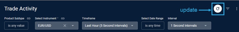
Choose an instrument from the Select Instrument dropdown.
Choose a Timeframe:
- Today (2 Min Intervals)
- Last Hour (5 Second Intervals)
- Last 4 Hours (30 Second Intervals)
- This Week (30 Minute Intervals)
- Previous Week (30 Minute Internals)
- Current Month (1 Hour Intervals)
- Previous Month (1 Hour Intervals)
- Select Data Range (Choose Interval) - to select a specific time
Use Interval to change the default Timeframe intervals.
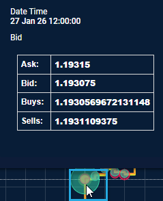
Hover
To view details for a point in time, hover over a data point.
Zoom
To get a closer look at the data, click and drag over a specific interval. Click Reset zoom to return to the main chart.

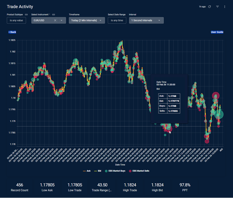
The following example looks at EURUSD activity in EBS Market. Bubble sizes adjust to represent volume of the trade flow on EBS Market per time period relative to other trades in the displayed timeframe.
The green bubbles represent Buys, and red bubbles represent Sells.
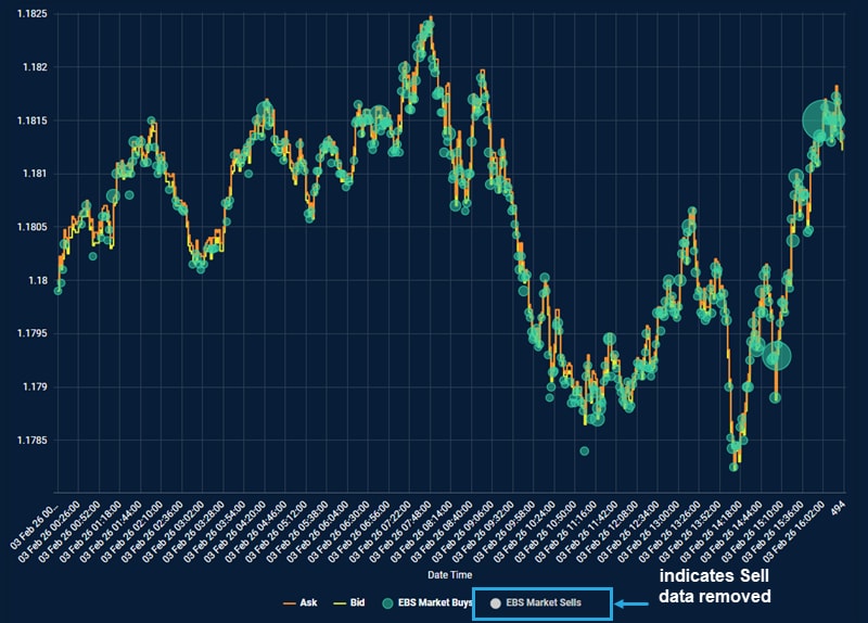
To filter a data set from the graph click the name on the key. In the example below, EBS Market Sells was removed from the chart below:
The summary underneath the chart includes the following: record count, low and high asks and bids of EBS Market trade, and trade range in pips. and the PPT (price points traded metric ) which shows the % of price increment traded within the daily range.


